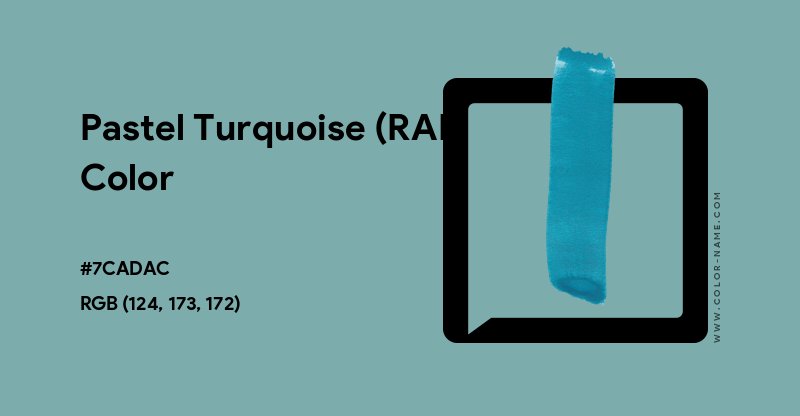
What is Pastel Turquoise (RAL) Color?
Pastel Turquoise (RAL) color hex code is #7CADAC and RGB (124, 173, 172). As per HSB/HSV model, the color has a hue of 179°, saturation of 28% and a brightness of 68%. The CMYK values of Pastel Turquoise (RAL) are C:28 M:0 Y:1 K:32.
Pastel Turquoise is from the RAL Classic list and has the number RAL 6034.
Please note: RAL colors displayed on the screen are close approximates to the actual color because of the variations in brightness and contrast. The same hold true for these colors printed out on standard printers where the variations in the quality of paper, ink and the device may produce different results.
Download Pastel Turquoise (RAL) Solid Color Background
Pastel Turquoise (RAL) Color Codes
| Hex Code | #7CADAC |
| RGB Values | (124, 173, 172) |
| CMYK Values | (28%, 0%, 1%, 32%) |
| HSV/HSB Values | (179°, 28%, 68%) |
| Closest Web Safe | #669999 |
| Inverse Color | #835253 [Spicy Mix] |
| Closest Pantone® | 5493 C |
| RAL | 6034 |
| Complementary Color | #AD7C7D [Turkish Rose] |
| Pastel Turquoise (RAL) Converted to Grayscale Codes | |
|---|---|
| Simple Average | #9C9C9C |
| Desaturated | #959595 |
| Weighted Average (Most Common) | #9E9E9E |
| Weighted Average (Luma) | #A3A3A3 |
| Weighted Average (Gamma Adjusted) | #CACACA |
Pastel Turquoise (RAL) Color Palettes

Complementary Palette
The complement of Pastel Turquoise (RAL) is Turkish Rose with the hex code #AD7C7D. Complementary colors are those found at the opposite ends of the color wheel. Thus, as per the RGB system, the best contrast to #7CADAC color is offered by #AD7C7D. The complementary color palette is easiest to use and work with. Studies have shown that contrasting color palette is the best way to grab a viewer's attention.

Analogous Palette
The analogous colors of Pastel Turquoise (RAL) (#7CADAC) are Weldon Blue (#7C96AD) and Green Sheen (#7CAD94). In the RGB color wheel, these two analogous colors occur to the right and left of Pastel Turquoise (RAL) with a 30° separation on either side. An analogous color palette is extremely soothing to the eyes and works wonders if your main color is soft or pastel.

Split-Complementary Palette
As per the RGB color wheel, the split-complementary colors of Pastel Turquoise (RAL) (#7CADAC) are #AD7C96 (English Lavender) and #AD947C (Grullo). A split-complementary color palette consists of the main color along with those on either side (30°) of the complementary color. Based on our research, usage of split-complementary palettes is on the rise online, especially in graphics and web sites designs. It may be because it is not as contrasting as the complementary color palette and, hence, results in a combination which is pleasant to the eyes.

Triadic Palette
Pastel Turquoise (RAL) triadic color palette has three colors each of which is separated by 120° in the RGB wheel. Thus, #AC7CAD (Opera Mauve) and #ADAC7C (Misty Moss) along with #7CADAC create a stunning and beautiful triadic palette with the maximum variation in hue and, therefore, offering the best possible contrast when taken together.

Tetradic Palette
The tetradic palette of Pastel Turquoise (RAL) has four colors - #AC7CAD (Opera Mauve), #AD7C7D (Turkish Rose) and #7DAD7C (Iguana Green) in addition to the base color (#7CADAC). A tetradic color palette is complex and, in most cases, should not be used off-the-shelf. We suggest tweaking the colors slightly to achieve desired results.

Square Palette
Pastel Turquoise (RAL) square color palette has #947CAD (Lavender Purple), #AD7C7D (Turkish Rose) and #96AD7C (Olivine). Quite like triadic, the hues in a square palette are at the maximum distance from each other, which is 90°.
Note: For several colors purposes, a square palette may look much better than the tetrad color palette.

Pastel Turquoise (RAL) Color Rainbow Palette
Our Pastel Turquoise (RAL) rainbow color palette is based on the RGB model and consists of 7 colors, just like the traditional rainbow. You might not see a lot of variation in color, especially if the chosen color is dark or extremely light. However, this can lead interesting rainbow palettes that are faded, soft, pastel or dull.
Tints, Tones & Shades of Pastel Turquoise (RAL) Color
Tints
 96BDBD
- A3C6C5
- B0CECD
- BED6D6
- CBDEDE
- D8E6E6
- E5EFEE
- F2F7F7
Tones
- 7DA4A3
- 7DA09F
- 7E9B9A
- 7E9796
- 7E9292
- 7F8E8D
- 7F8989
- 808584
Shades
- 638A8A
- 577978
- 4A6867
- 3E5756
- 324545
- 253434
- 192322
- 0C1111
Pastel Turquoise (RAL) Color Patterns
Pastel Turquoise (RAL) Color Interior Ideas
Pastel Turquoise (RAL) Color Drawing Room Textured Wall Paint Idea
Pastel Turquoise (RAL) Color Living Room Wall Paint Idea
Pastel Turquoise (RAL) Color Bedroom Wall Paint Idea
Pastel Turquoise (RAL) Color Kitchen Wall Paint Idea
Latest Colors & Names
-

Turkish Red
#C8102E -

Alphabet Red
#ED1C24 -

Twitter New Logo Black
#000000 -

Nokia Blue
#005aff -

Poseidon (Pantone)
#133955 -

-

Snow White (Pantone)
#F2F0EB -
