Search Colors

#DA70D6 Hex Code

Color Name: Orchid

What is hex #DA70D6 Color?

Orchid (Hex code: DA70D6) Thumbnail

The color name of hex code #DA70D6 is Orchid. The RGB values are (218, 112, 214) which means it is composed of 40% red, 21% green and 39% blue. The CMYK color codes, used in printers, are C:0 M:49 Y:2 K:15. In the HSV/HSB scale, #DA70D6 has a hue of 302°, 49% saturation and a brightness value of 85%.
Details of other color codes including equivalent web safe and HTML & CSS colors are given in the table below. Also listed are the closest Pantone® (PMS) and RAL colors.
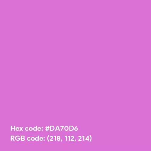
Download Orchid Solid Color Background


Hex #DA70D6 Color Codes

Color NameOrchid
RGB Values(218, 112, 214)
CMYK Values(0%, 49%, 2%, 15%)
HSV/HSB Values(302°, 49%, 85%)
Closest Web Safe#CC66CC
Inverse Color#258F29 [Forest Green (Web)]
Closest Pantone®2375 C
Closest RAL3015 [Light pink]
Complementary Color#70DA74 [Pastel Green]
#DA70D6 Converted to Grayscale Codes
Simple Average#B5B5B5
Desaturated#A5A5A5
Weighted Average (Most Common)#9B9B9B
Weighted Average (Luma)#8E8E8E
Weighted Average (Gamma Adjusted)#BEBEBE

Hex #DA70D6 Color Palettes

Complementary color palette of DA70D6. Complementary color is 70DA74

Complementary Palette

The complement of #DA70D6 is #70DA74 which is called Pastel Green. Complementary colors are those found at the opposite ends of the color wheel. Thus, as per the RGB system, the best contrast to #DA70D6 color is offered by #70DA74. The complementary color palette is easiest to use and work with. Studies have shown that contrasting color palette is the best way to grab a viewer's attention.

DA70D6 70DA74
Analogous color palette with (DA70D6, DA70A1 and A970DA)

Analogous Palette

The analogous colors of #DA70D6 are #DA70A1 and #A970DA, called Chinese Pink and Rich Lavender, respectively. In the RGB color wheel, they are located to the right and left of #DA70D6 with a 30° separation. An analogous color palette is extremely soothing to the eyes and works wonders if your main color is soft or pastel.

DA70D6 DA70A1 A970DA
Split Complementary color palette with (DA70D6, A1DA70 and 70DAA9)

Split-Complementary Palette

As per the RGB color wheel, the split-complementary colors of #DA70D6 are #A1DA70 (Pistachio) and #70DAA9 (Medium Aquamarine). A split-complementary color palette consists of the main color along with those on either side (30°) of the complementary color. Based on our research, usage of split-complementary palettes is on the rise online, especially in graphics and web sites designs. It may be because it is not as contrasting as the complementary color palette and, hence, results in a combination which is pleasant to the eyes.

DA70D6 A1DA70 70DAA9
Triadic color palette with (DA70D6, D6DA70 and 70D6DA)

Triadic Palette

#DA70D6 triadic color palette has three colors each of which is separated by 120° in the RGB wheel. Thus, #D6DA70 (Booger Buster) and #70D6DA (Sky Blue (Crayola)) along with #DA70D6, our main color, create a stunning and beautiful triadic palette with the maximum variation in hue and, therefore, offering the best possible contrast when taken together.

DA70D6 D6DA70 70D6DA
Tetradic color palette with (DA70D6, D6DA70, 70DA74 and 7470DA)

Tetradic Palette

The tetradic palette of #DA70D6 has #D6DA70 (Booger Buster), #70DA74 (Pastel Green) and #7470DA (Violet-Blue (Crayola)). A tetradic color palette is complex and, in most cases, should not be used off-the-shelf. We suggest tweaking the colors a little bit to achieve desired results.

DA70D6 D6DA70 70DA74 7470DA
Square color palette with (DA70D6, DAA970, 70DA74 and 70A1DA)

Square Palette

The square color palette of #DA70D6 contains #DAA970 (Fawn), #70DA74 (Pastel Green) and #70A1DA (Little Boy Blue). Quite like triadic, the hues in a square palette are at the maximum distance from each other, which is 90°.
Note: For several colors purposes, a square palette may look much better than the tetrad color palette.

DA70D6 DAA970 70DA74 70A1DA
Rainbow color

Hex #DA70D6 Rainbow Colors Palette

Our #DA70D6 rainbow color palette is based on the RGB color model and consists of 7 colors, just like the traditional rainbow. You might not see a lot of variation in color, especially if the chosen color is dark or extremely light. However, this can lead interesting rainbow palettes that are faded, soft, pastel or dull.

DA70D6 DA707C DABF70 9ADA70 70DAA1 70B8DA 8370DA

Tints, Tones & Shades of DA70D6 Color

Tints

  • Transparent E18DDEE18DDE
  • Transparent E59BE2E59BE2
  • Transparent E9A9E6E9A9E6
  • Transparent EDB8EBEDB8EB
  • Transparent F0C6EFF0C6EF
  • Transparent F4D4F3F4D4F3
  • Transparent F8E2F7F8E2F7
  • Transparent FBF1FBFBF1FB

Tones

  • Transparent C873C5C873C5
  • Transparent BF75BCBF75BC
  • Transparent B676B4B676B4
  • Transparent AD78ABAD78AB
  • Transparent A47AA2A47AA2
  • Transparent 9B7B9A9B7B9A
  • Transparent 927D91927D91
  • Transparent 897E89897E89

Shades

  • Transparent AE5AABAE5AAB
  • Transparent 994E96994E96
  • Transparent 834380834380
  • Transparent 6D386B6D386B
  • Transparent 572D56572D56
  • Transparent 412240412240
  • Transparent 2C162B2C162B
  • Transparent 160B15160B15

#DA70D6 Color Patterns

  • transperent

    #DA70D6 Gingham Checks

  • transperent

    #DA70D6 Vertical Stripes Pattern

  • transperent

    #DA70D6 Polka Dots Pattern

  • transperent

    #DA70D6 Honeycomb Pattern

  • transperent

    #DA70D6 Leaves Pattern

  • transperent

    #DA70D6 Houndstooth Pattern

  • transperent

    #DA70D6 Trellis Pattern

  • transperent

    #DA70D6 Plaid Pattern


#DA70D6 Color Interior Ideas

Pretty Photo frame on Orchid color drawing room interior textured wall

#DA70D6 Color Drawing Room Textured Wall Paint Idea

Pretty Photo frame on Orchid color Living room wal color

#DA70D6 Color Living Room Wall Paint Idea

Pretty Photo frame on Orchid color Bedroom interior wall color

#DA70D6 Color Bedroom Wall Paint Idea

Pretty Photo frame on Orchid color kitchen interior wall color

#DA70D6 Color Kitchen Wall Paint Idea


Color names have been derived from known and trusted lists OR have been formulated by us. They are close approximations and may not translate to exact names. Also, color is perceived and named differently in cultures and communities around the world. As per studies, only a handful of colors are interpretted and named in the same way across the globe.