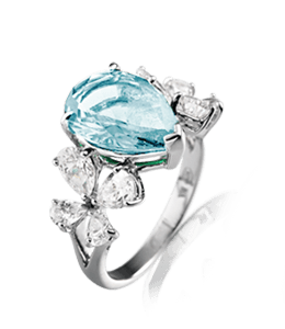
What is Pretty Light Blue Color?
Pretty Light Blue has the hex code #ABCED7. The equivalent RGB values are (171, 206, 215), which means it is composed of
29% red, 35% green and 36% blue. The CMYK color codes, used in printers, are C:21 M:4 Y:0 K:16. In the HSV/HSB scale, Pretty Light Blue has a hue of 192°, 20% saturation and a brightness value of 84%.
Details of other color codes including equivalent web safe and HTML & CSS colors are given in the table below. Also listed are the closest Pantone® (PMS) and RAL colors.
Pretty Light Blue color is not included in the web list and cannot be used by name in HTML and CSS code. However, Pretty Light Blue can be applied to web pages with its hex code, RGB and/or HSL values. Please note that the CMYK numbers listed on this page have been derived from the hexadecimal code using known formulae and are only approximates.
Download Pretty Light Blue Solid Color Background
Pretty Light Blue Color Codes
| Hex Code | #ABCED7 |
| RGB Values | (171, 206, 215) |
| CMYK Values | (21%, 4%, 0%, 16%) |
| HSV/HSB Values | (192°, 20%, 84%) |
| Closest Web Safe | #99CCCC |
| Inverse Color | #543128 [Brown Coffee] |
| Closest Pantone® | 2204 C |
| Closest RAL | 7035 [Light grey] |
| Complementary Color | #D7B4AB [Pale Chestnut] |
| Pretty Light Blue Converted to Grayscale Codes | |
|---|---|
| Simple Average | #C5C5C5 |
| Desaturated | #C1C1C1 |
| Weighted Average (Most Common) | #C4C4C4 |
| Weighted Average (Luma) | #C7C7C7 |
| Weighted Average (Gamma Adjusted) | #DDDDDD |
Pretty Light Blue Color Palettes
Complementary Palette
The complement of Pretty Light Blue is Pale Chestnut with the hex code #D7B4AB. Complementary colors are those found at the opposite ends of the color wheel. Thus, as per the RGB system, the best contrast to #ABCED7 color is offered by #D7B4AB. The complementary color palette is easiest to use and work with. Studies have shown that contrasting color palette is the best way to grab a viewer's attention.
Analogous Palette
The analogous colors of Pretty Light Blue (#ABCED7) are Light Steel Blue (#ABB8D7) and Jet Stream (#ABD7CA). In the RGB color wheel, these two analogous colors occur to the right and left of Pretty Light Blue with a 30° separation on either side. An analogous color palette is extremely soothing to the eyes and works wonders if your main color is soft or pastel.
Split-Complementary Palette
As per the RGB color wheel, the split-complementary colors of Pretty Light Blue (#ABCED7) are #D7ABB8 (Pale Chestnut) and #D7CAAB (Dark Vanilla). A split-complementary color palette consists of the main color along with those on either side (30°) of the complementary color. Based on our research, usage of split-complementary palettes is on the rise online, especially in graphics and web sites designs. It may be because it is not as contrasting as the complementary color palette and, hence, results in a combination which is pleasant to the eyes.
Triadic Palette
Pretty Light Blue triadic color palette has three colors each of which is separated by 120° in the RGB wheel. Thus, #D7ABCE (Pink Lavender) and #CED7AB (Dark Vanilla) along with #ABCED7 create a stunning and beautiful triadic palette with the maximum variation in hue and, therefore, offering the best possible contrast when taken together.
Tetradic Palette
The tetradic palette of Pretty Light Blue has four colors - #D7ABCE (Pink Lavender), #D7B4AB (Pale Chestnut) and #ABD7B4 (Light Moss Green) in addition to the base color (#ABCED7). A tetradic color palette is complex and, in most cases, should not be used off-the-shelf. We suggest tweaking the colors slightly to achieve desired results.
Square Palette
Pretty Light Blue square color palette has #CAABD7 (Tropical Violet), #D7B4AB (Pale Chestnut) and #B8D7AB (Light Moss Green). Quite like triadic, the hues in a square palette are at the maximum distance from each other, which is 90°.
Note: For several colors purposes, a square palette may look much better than the tetrad color palette.
Pretty Light Blue Color Rainbow Palette
Our Pretty Light Blue rainbow color palette is based on the RGB model and consists of 7 colors, just like the traditional rainbow. You might not see a lot of variation in color, especially if the chosen color is dark or extremely light. However, this can lead interesting rainbow palettes that are faded, soft, pastel or dull.
Tints, Tones & Shades of Pretty Light Blue Color
Tints
 BCD8DF
 C4DDE3
 CDE2E7
 D5E7EB
 DDEBEF
 E6F0F3
 EEF5F7
 F7FAFB
Tones
 A2BEC6
 9EB7BD
 9AAFB4
 96A7AC
 919FA3
 8D979A
 899091
 848889
Shades
 89A5AC
 789097
 677C81
 56676C
 445256
 333E41
 22292B
 111516
Pretty Light Blue Color Patterns
Pretty Light Blue Color Interior Ideas
Pretty Light Blue Color Drawing Room Textured Wall Paint Idea
Pretty Light Blue Color Living Room Wall Paint Idea
Pretty Light Blue Color Bedroom Wall Paint Idea
Pretty Light Blue Color Kitchen Wall Paint Idea
Latest Colors & Names
-

Turkish Red
#C8102E -

Alphabet Red
#ED1C24 -

Twitter New Logo Black
#000000 -

Nokia Blue
#005aff -

Poseidon (Pantone)
#133955 -

-

Snow White (Pantone)
#F2F0EB -

